0%.
Loading
Electronics
2025
Elvatech®
Be an unmistakable hero
00:00
Play video
Client
Elvatech is a Ukrainian manufacturer of XRF analyzers, known throughout the scientific world.
Elvatech does not just represent Ukraine on the world stage. It is one of the flagships of the industry, which drives its development forward. The Ukrainian company creates more accurate, lightweight and convenient analyzers than global competitors.
XRF analyzers are devices that determine the exact chemical composition of any materials and objects on the planet. They allow you to determine whether the material is suitable for use, whether this material is safe, its origin. With the help of spectral analysis, you can even establish the authenticity of a work of art.
Therefore, without these devices, the work of any industry is impossible — construction, engineering, metallurgy, space programs, archeology, art history, etc. Analyzers are extremely important for the development of humanity.
And the most accurate of them are made in Kyiv.
Elvatech does not just represent Ukraine on the world stage. It is one of the flagships of the industry, which drives its development forward. The Ukrainian company creates more accurate, lightweight and convenient analyzers than global competitors.
XRF analyzers are devices that determine the exact chemical composition of any materials and objects on the planet. They allow you to determine whether the material is suitable for use, whether this material is safe, its origin. With the help of spectral analysis, you can even establish the authenticity of a work of art.
Therefore, without these devices, the work of any industry is impossible — construction, engineering, metallurgy, space programs, archeology, art history, etc. Analyzers are extremely important for the development of humanity.
And the most accurate of them are made in Kyiv.
Situation
Despite the obvious product advantages and a well-known name in its market, Elvatech still could not call itself top-of-mind for the audience.
Outdated identity, lack of advertising communication — without these components, it is difficult for brand to compete for attention with “beautiful” Western competitors.
So our task was to improve the brand. To develop a strategic foundation. To update the visual component. To think of how to convey the coolness of Elvatech to the global audience.
Outdated identity, lack of advertising communication — without these components, it is difficult for brand to compete for attention with “beautiful” Western competitors.
So our task was to improve the brand. To develop a strategic foundation. To update the visual component. To think of how to convey the coolness of Elvatech to the global audience.
Strategy
We spoke to scientists, chemists, engineers, workers, etc. from different parts of the world. And we found an interesting truth:
With an accurate analyzer in their hands, they feel like heroes
With an accurate analyzer in their hands, they feel like heroes
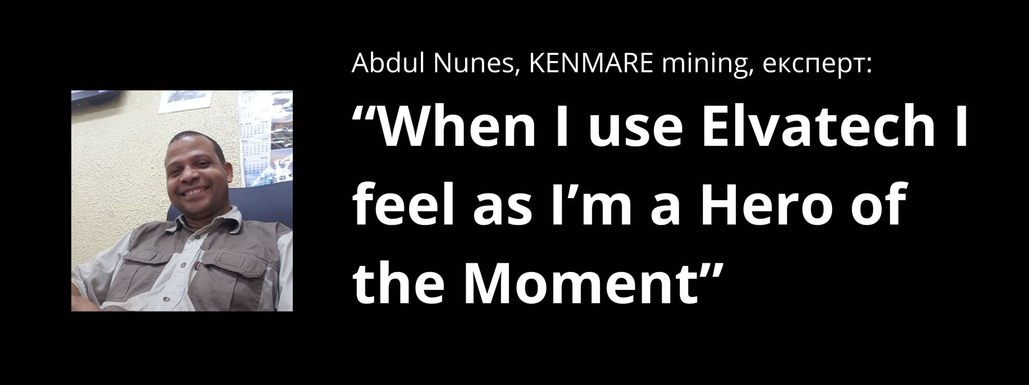
It's logical. Imagine, the fate of all further production, people's health, the truthfulness of historical facts depends on the results of your work... That's no small responsibility. But accuracy is your superpower. Because you press a button — and in a few seconds you already know the truth that the world is waiting for.
When a researcher knows that the device is accurate, he is confident in the results. And when he is confident in the results, he is confident in himself, like a real hero.
Elvatech does not just create devices. It helps to overcome uncertainty, to make the unknown known.
Now the brand slogan is "Accuracy that gives confidence".
And our strategy is to be a brand that turns people into heroes of the industry.

Identity
We decided not to revolutionize the macro universe, but chose the path of point improvement. To leave the company's long-standing heritage, but at the same time prepare it for future growth.
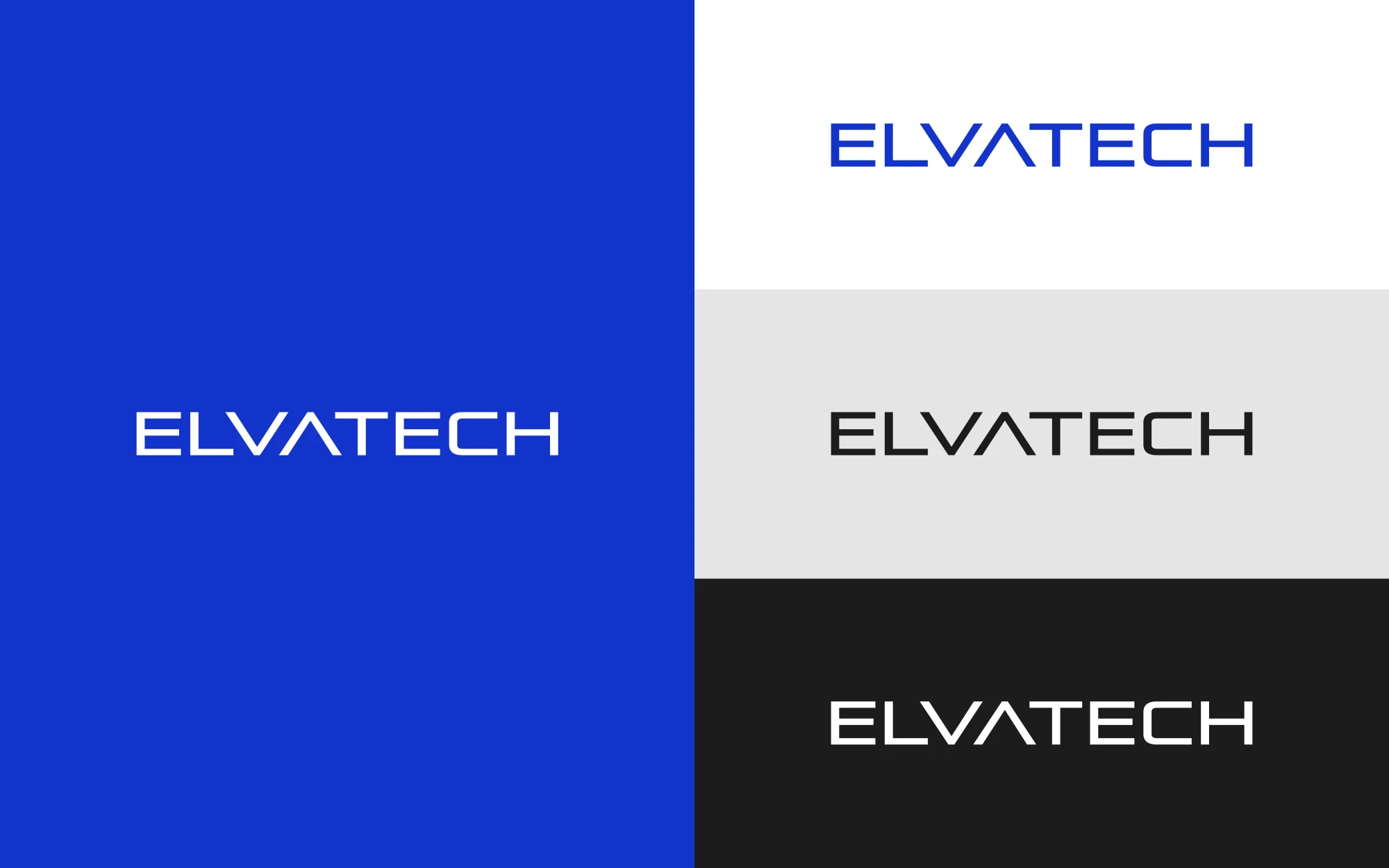
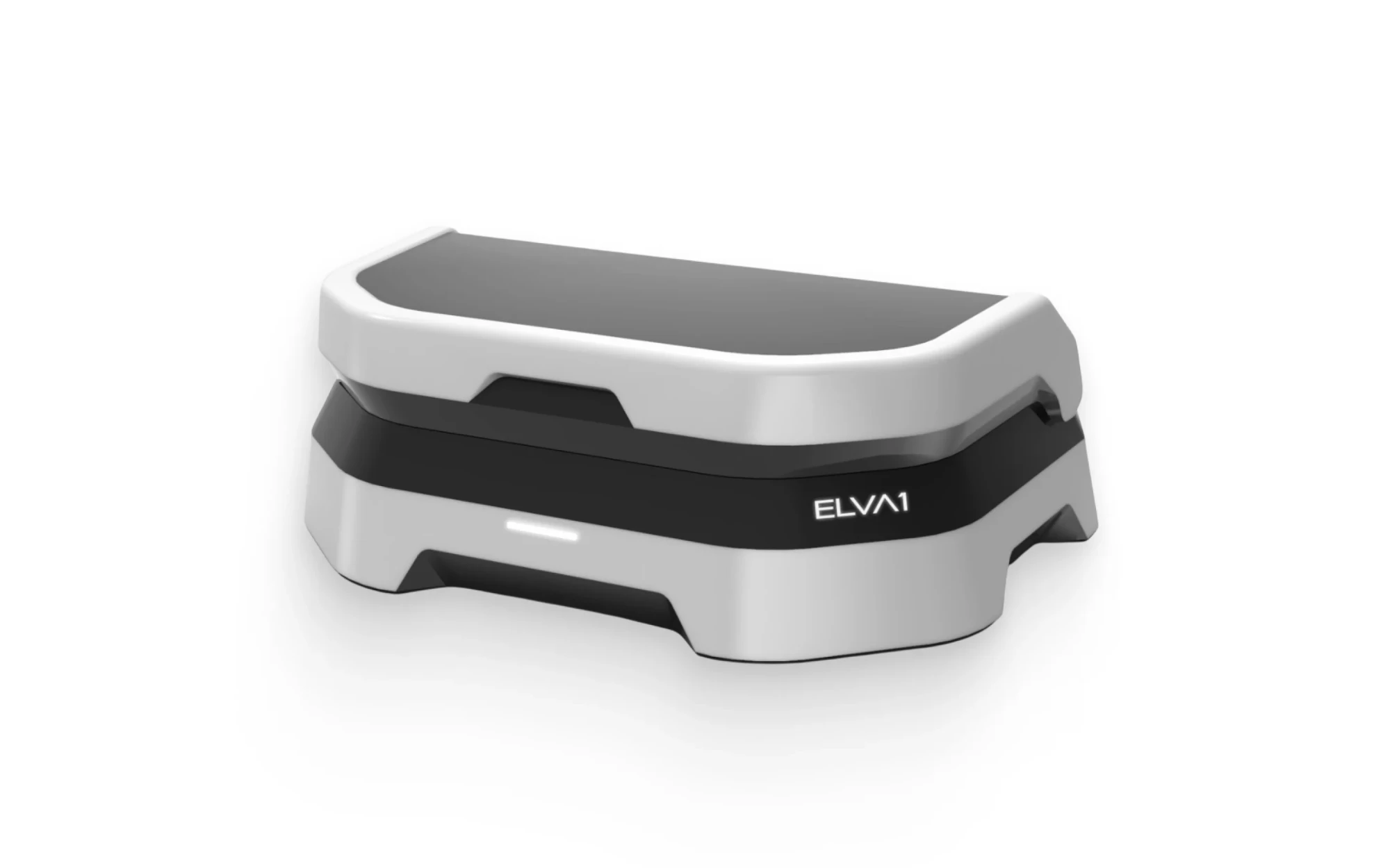
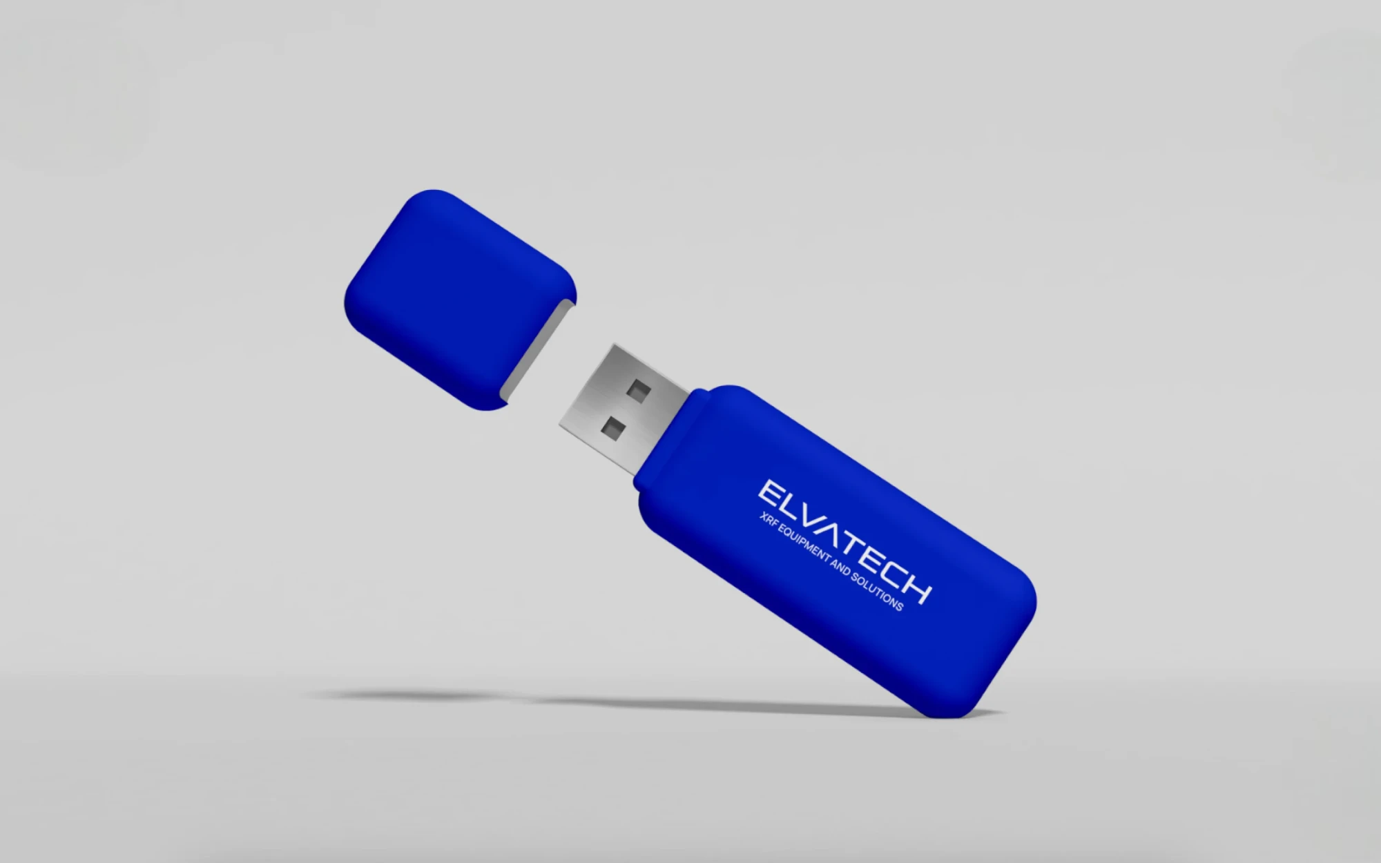
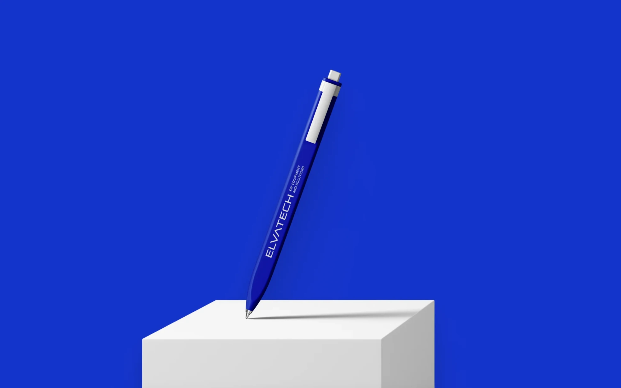
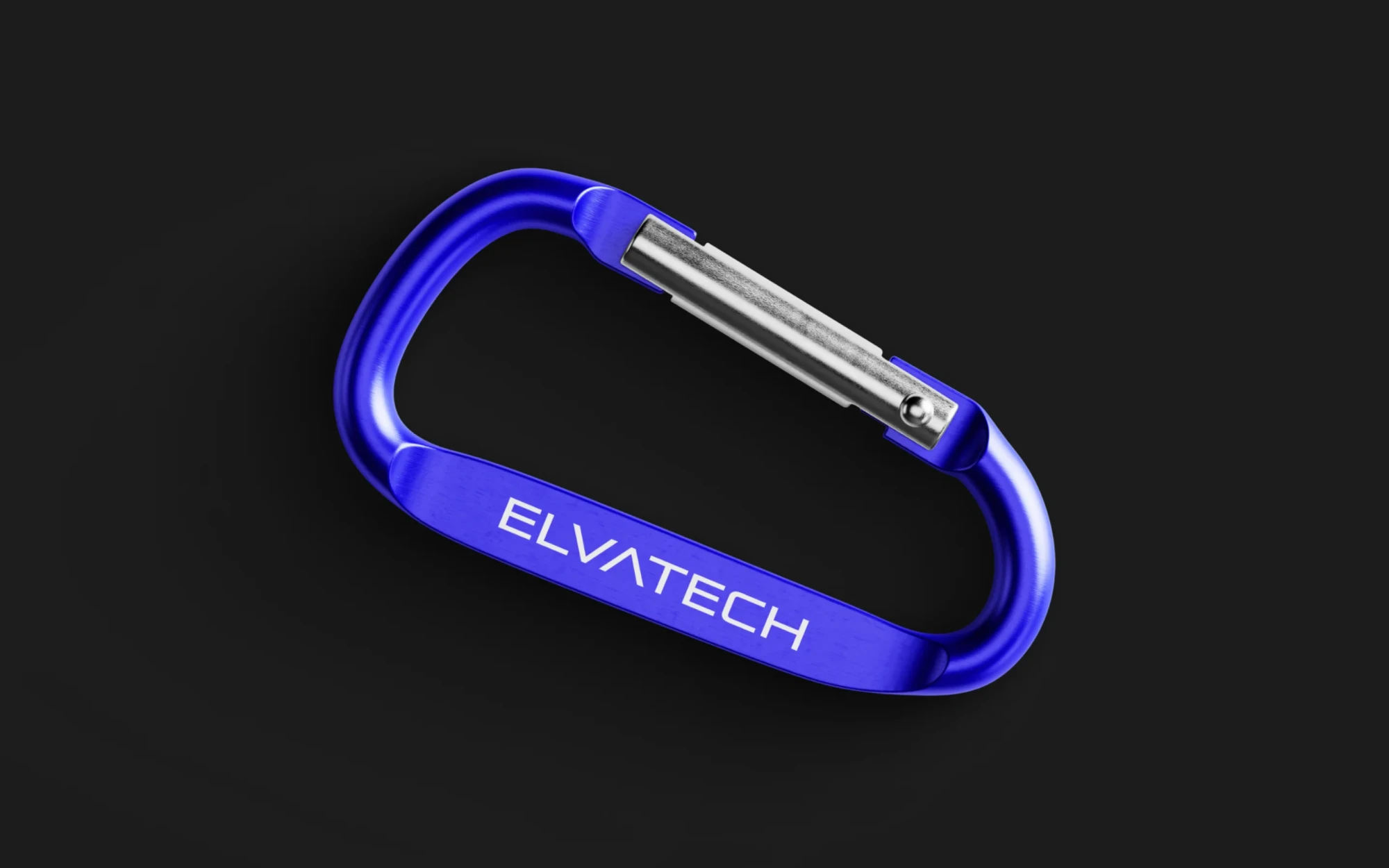
The font logo has precise and confident lines. Its mood corresponds to the positioning, because such a logo is easy to imagine at the headquarters of the team of heroes in a New York skyscraper.
Clear lines, minimalistic design, lack of unnecessary details - all this refers to the accuracy and practicality of our devices.
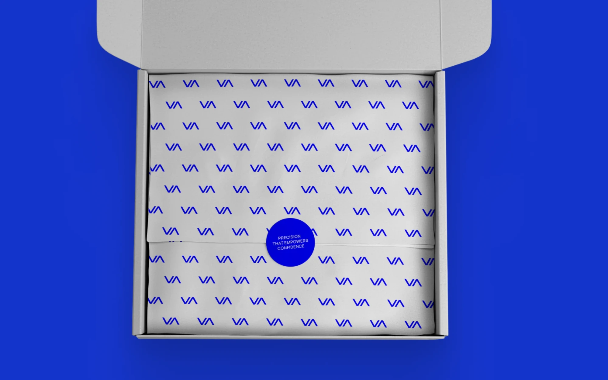
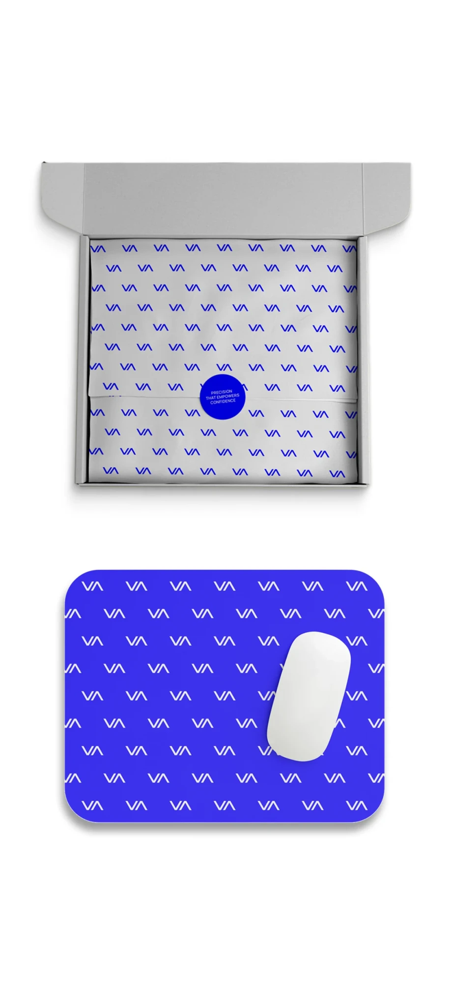
The letters A and V inside symbolize the up/down arrows that are displayed on the analyzers' screen during operation. These two arrow letters form a small sign.
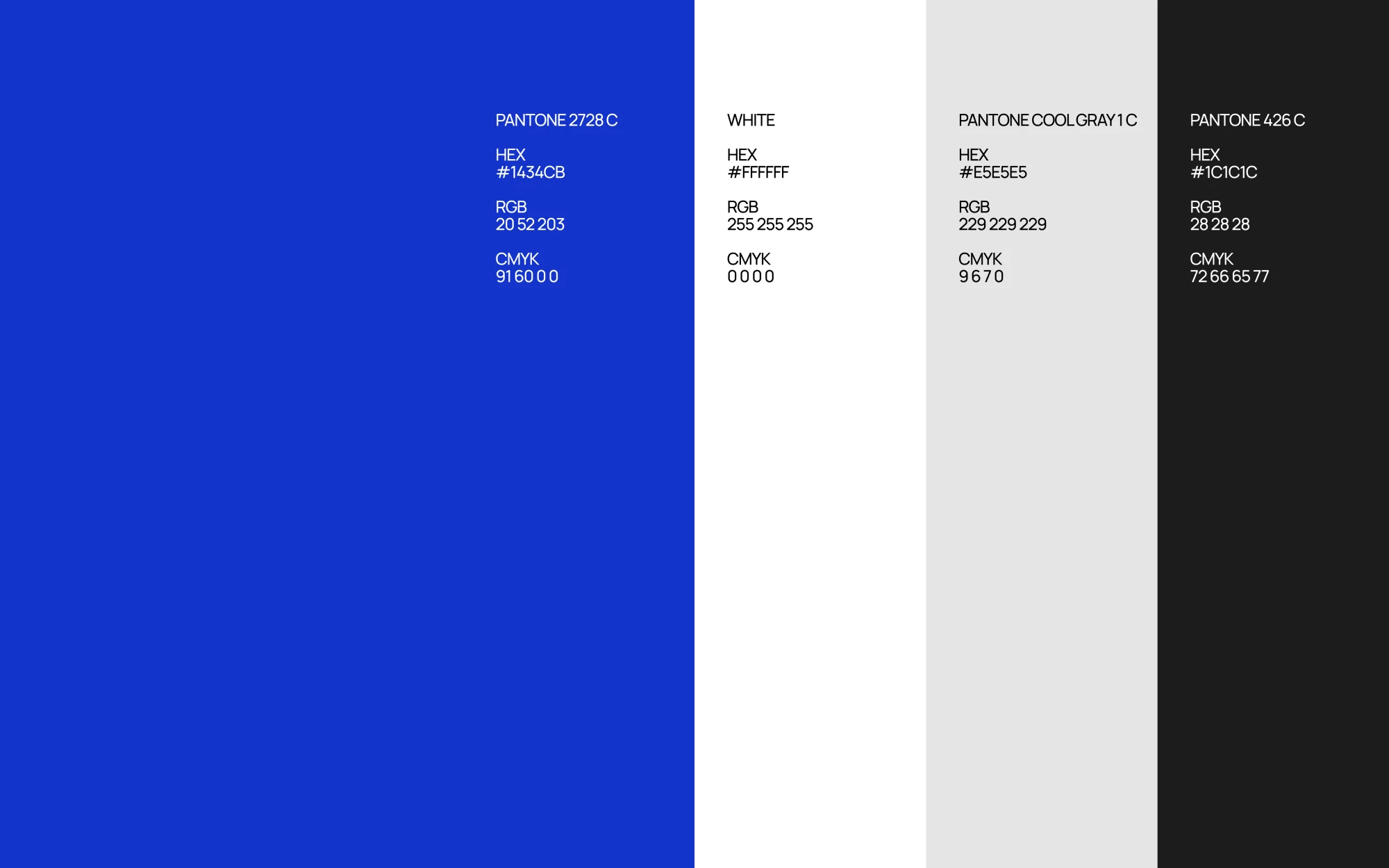
The new color palette includes four colors, each of which is carefully selected to convey trust, professionalism and advanced technology.
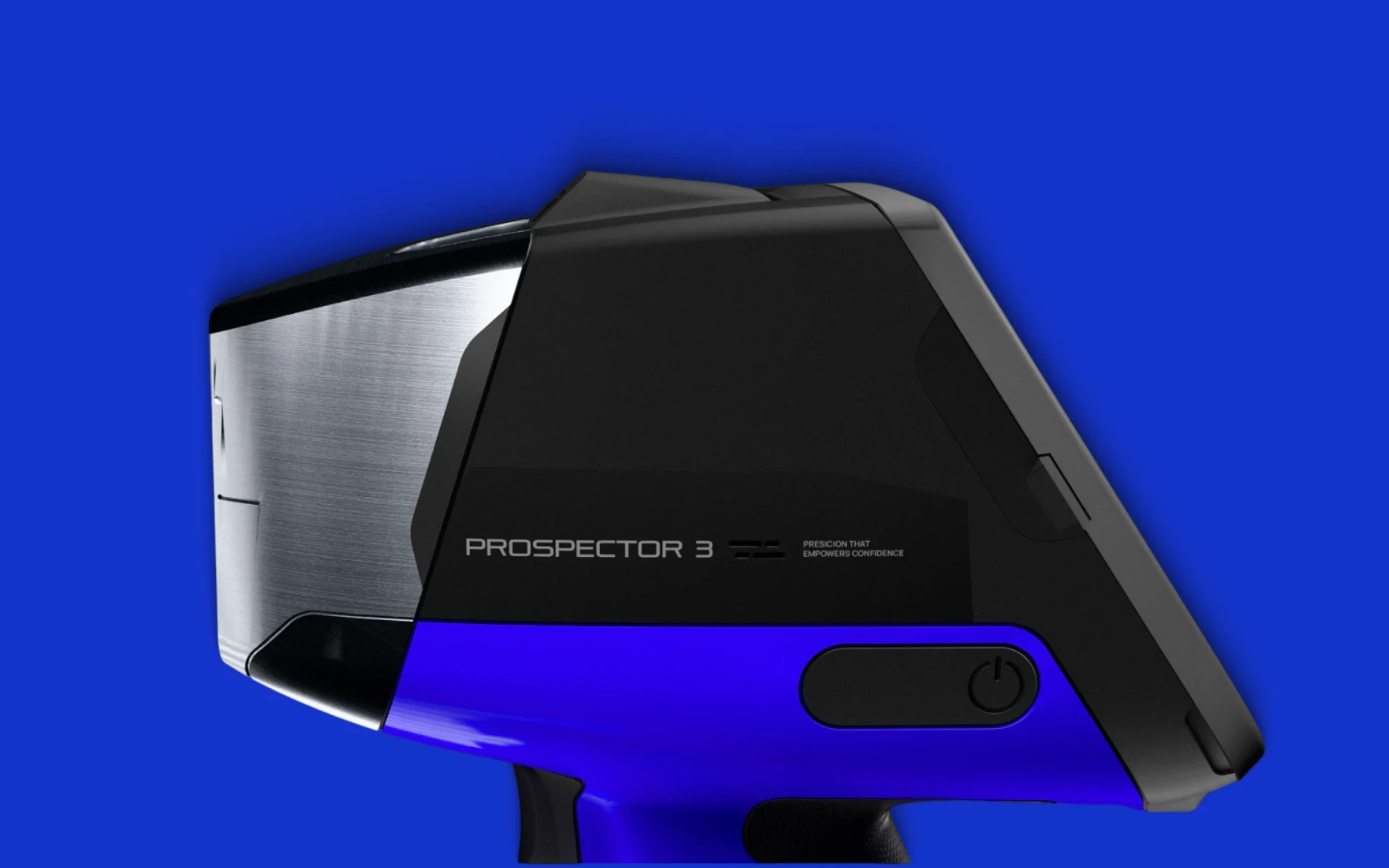
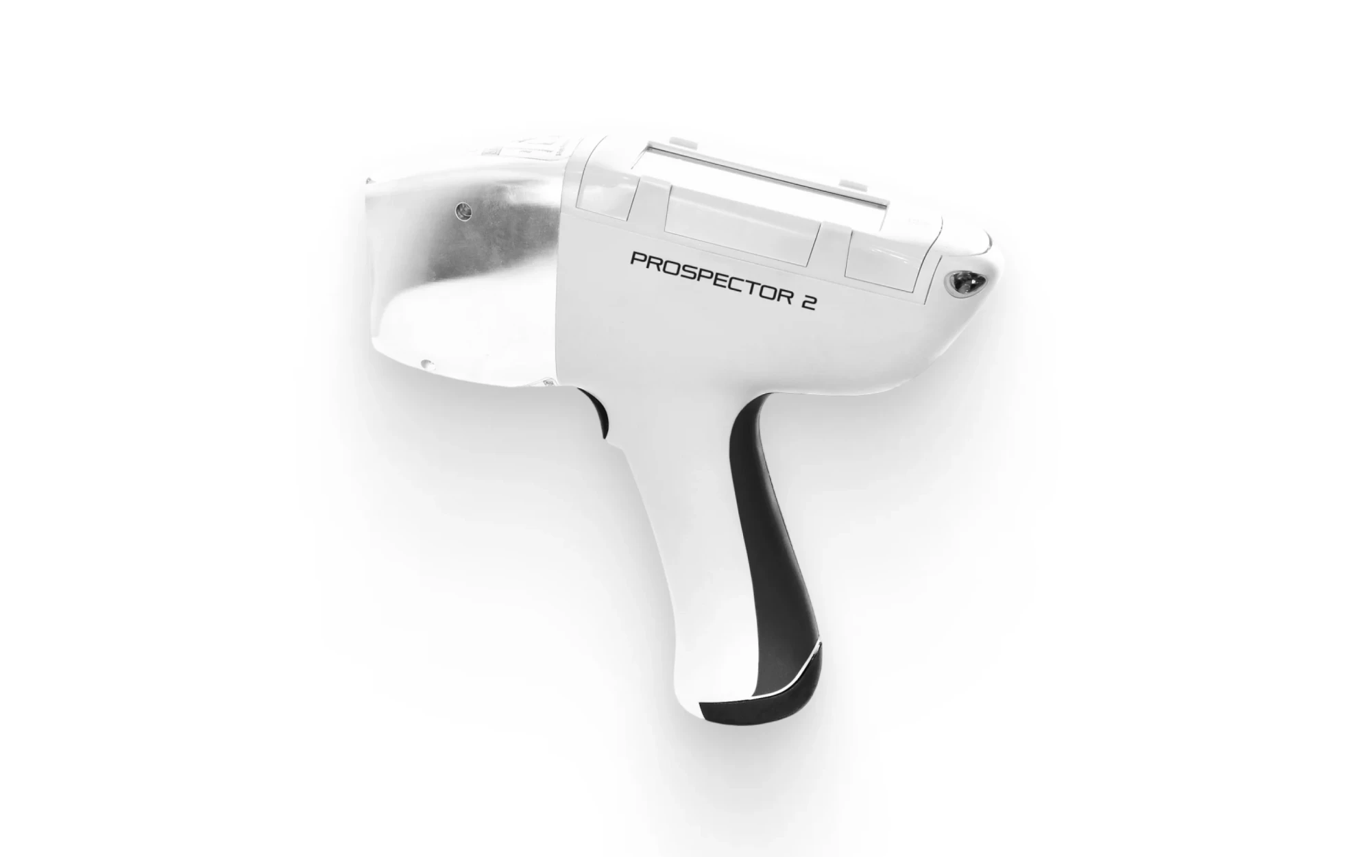
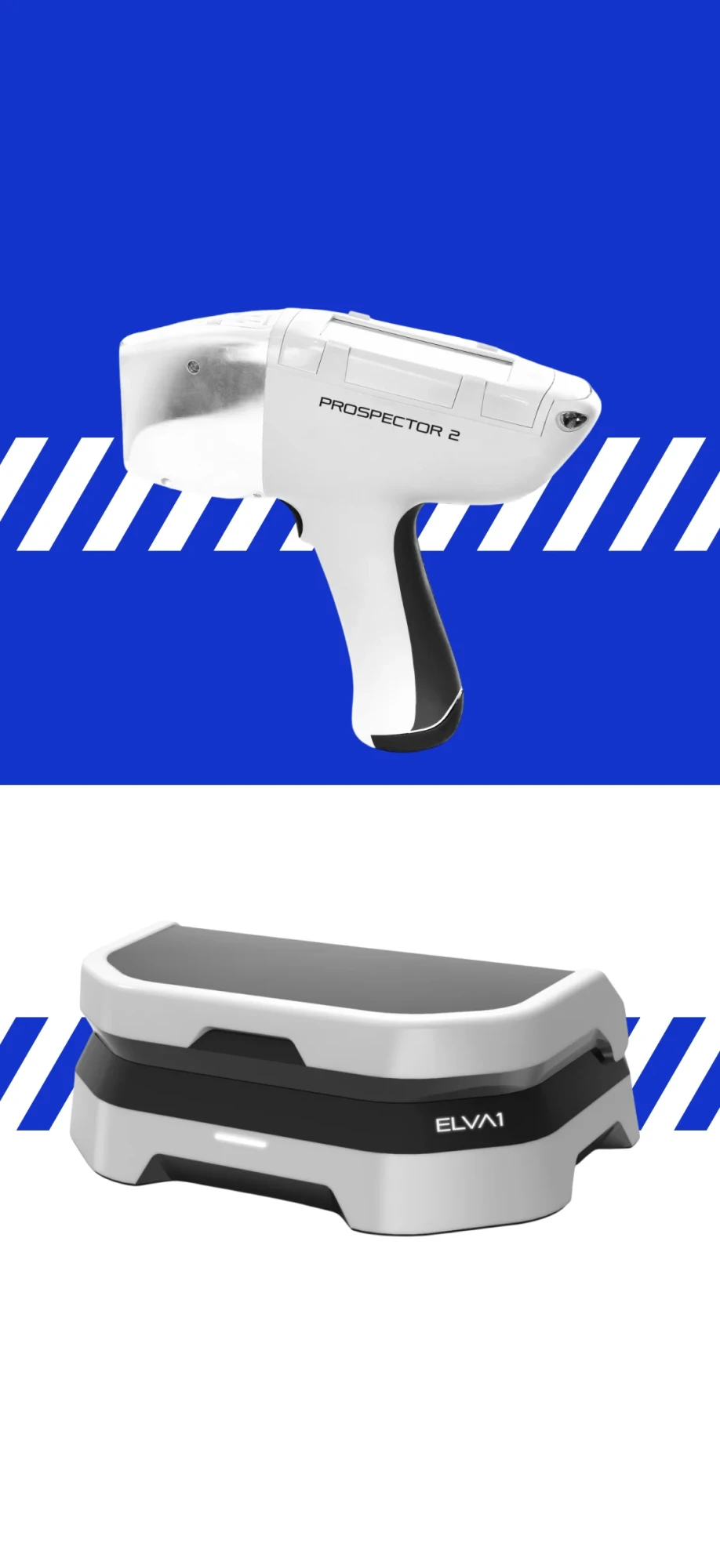
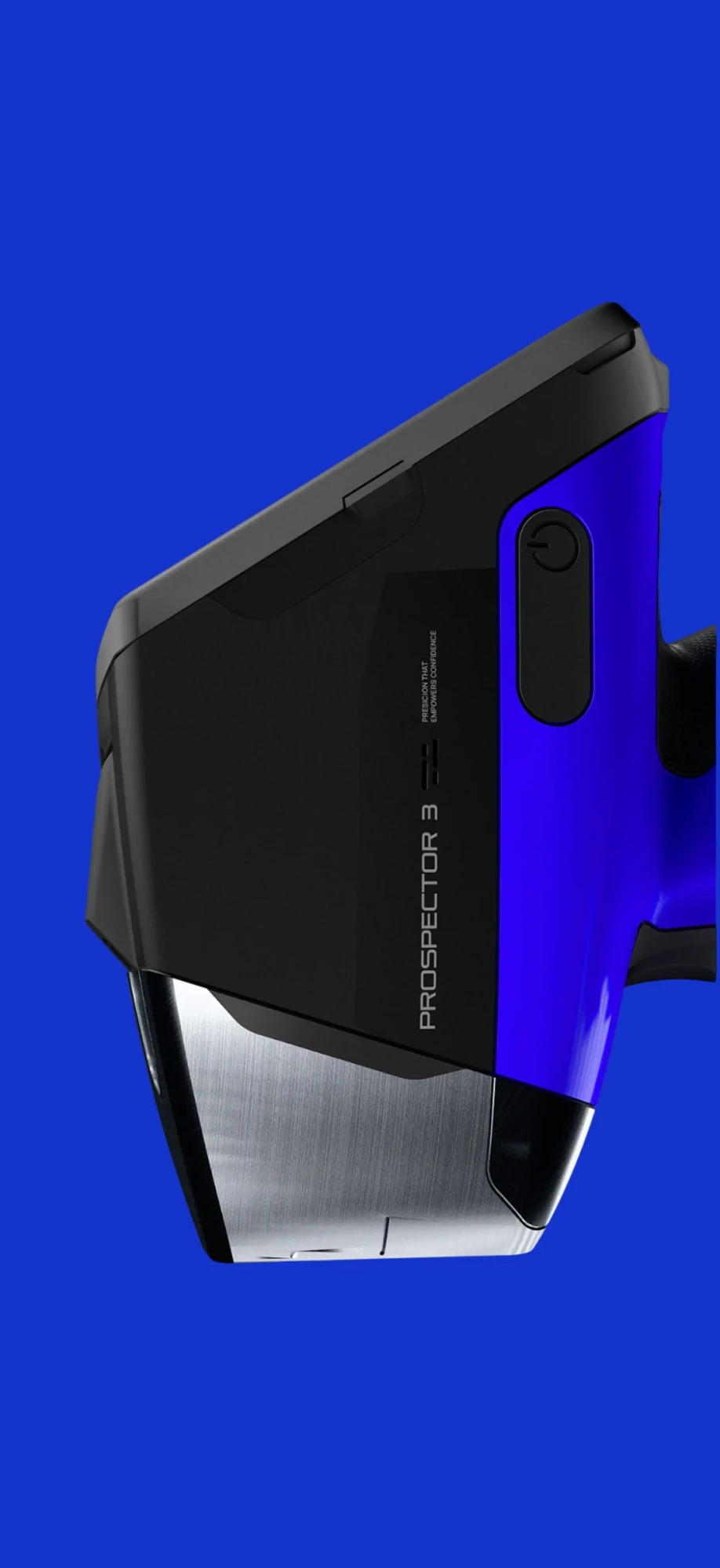
As a tribute to history, Elvatech’s main color remains blue. But we have improved the shade. The new blue is more confident, modern, and electric in every sense. The company has already started to implement it in product design.
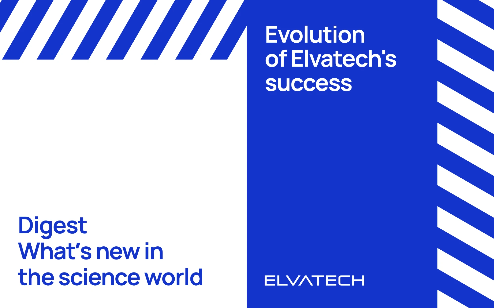
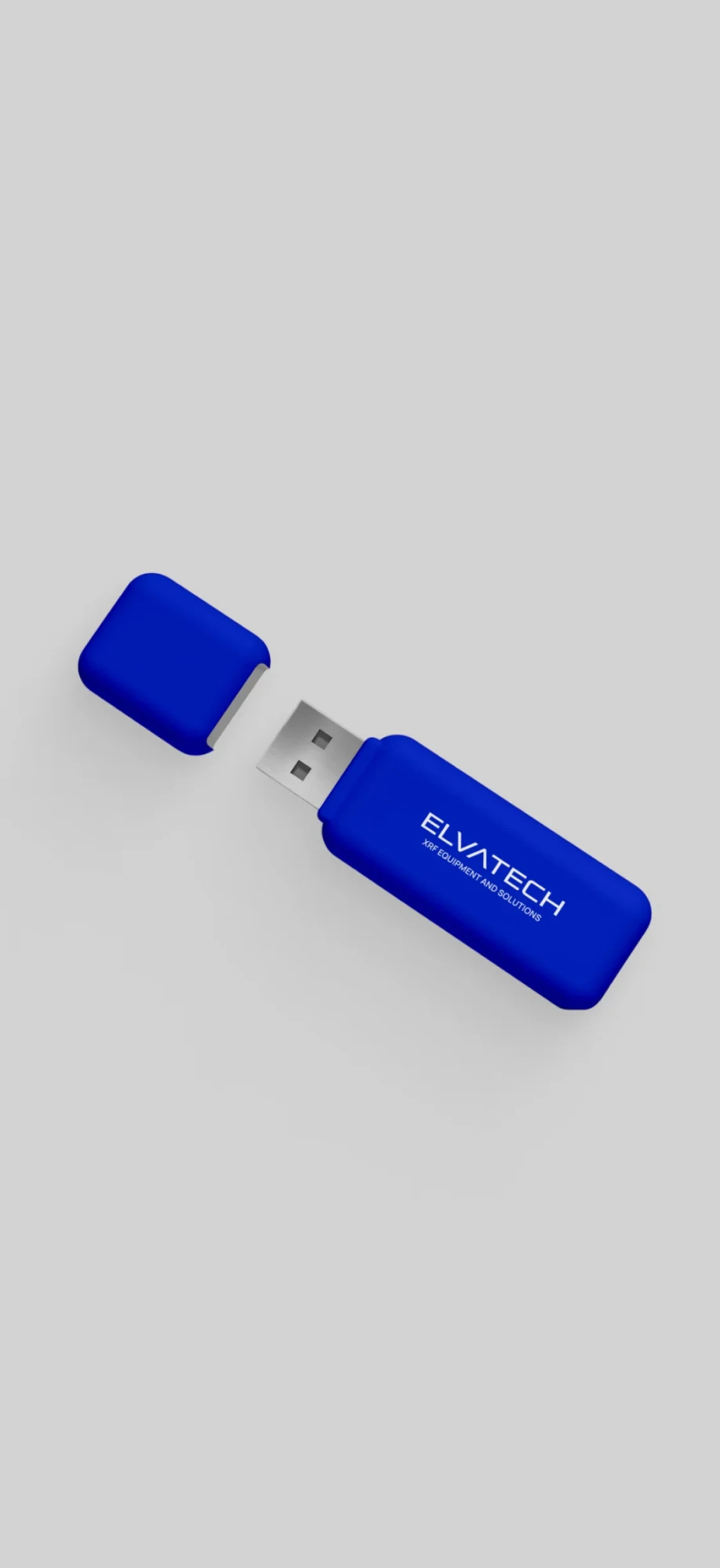
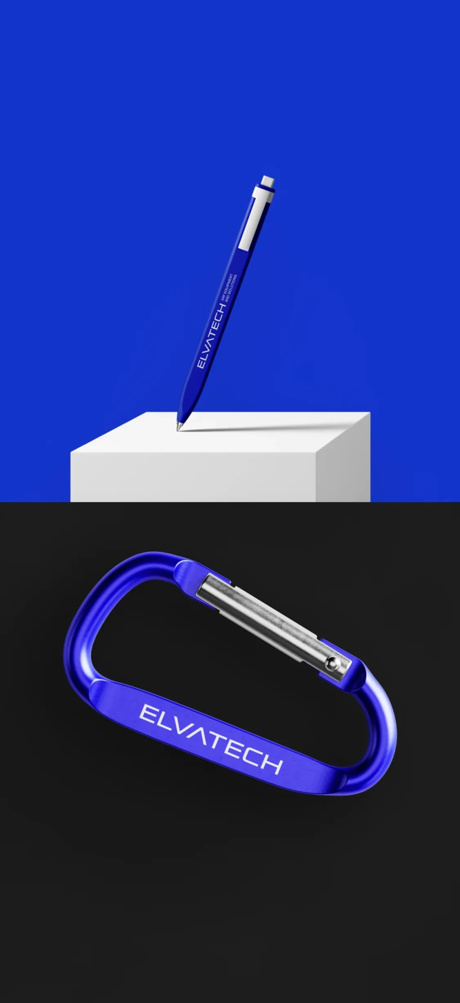
In addition to the small sign, an additional visual element is the “slash tape”. Its design is inspired by the marking of technical zones in production facilities. The slash tape makes the layouts more unique and interesting. Anyone who sees this element in the design will immediately recognize Elvatech.



Adverising campaign
The updated brand announced itself to the world with an epic image manifesto.
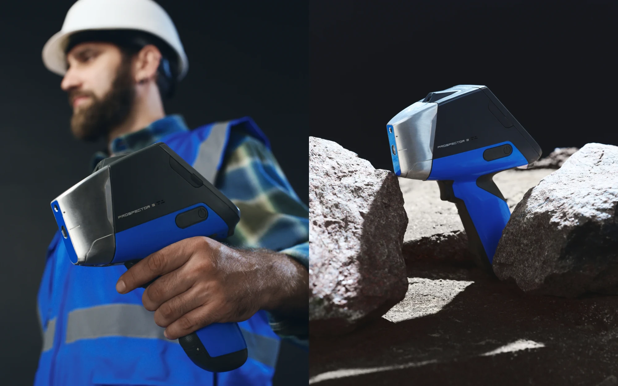
Based on the strategy, we wanted to show our audience as heroic. Progress, the well-being of humanity, and its history depend on them. But they are not afraid of responsibility. They take Elvatech devices and confidently turn the unknown into the known.
Based on the strategy, we wanted to show our audience as heroic. Progress, the well-being of humanity, and its history depend on them. But they are not afraid of responsibility. They take Elvatech devices and confidently turn the unknown into the known.
None of the competitors have yet communicated to the audience how important their work is. Elvatech was the first to show not only the coolness of the devices, but also the coolness of the users. This is how they win the hearts of a potential audience.
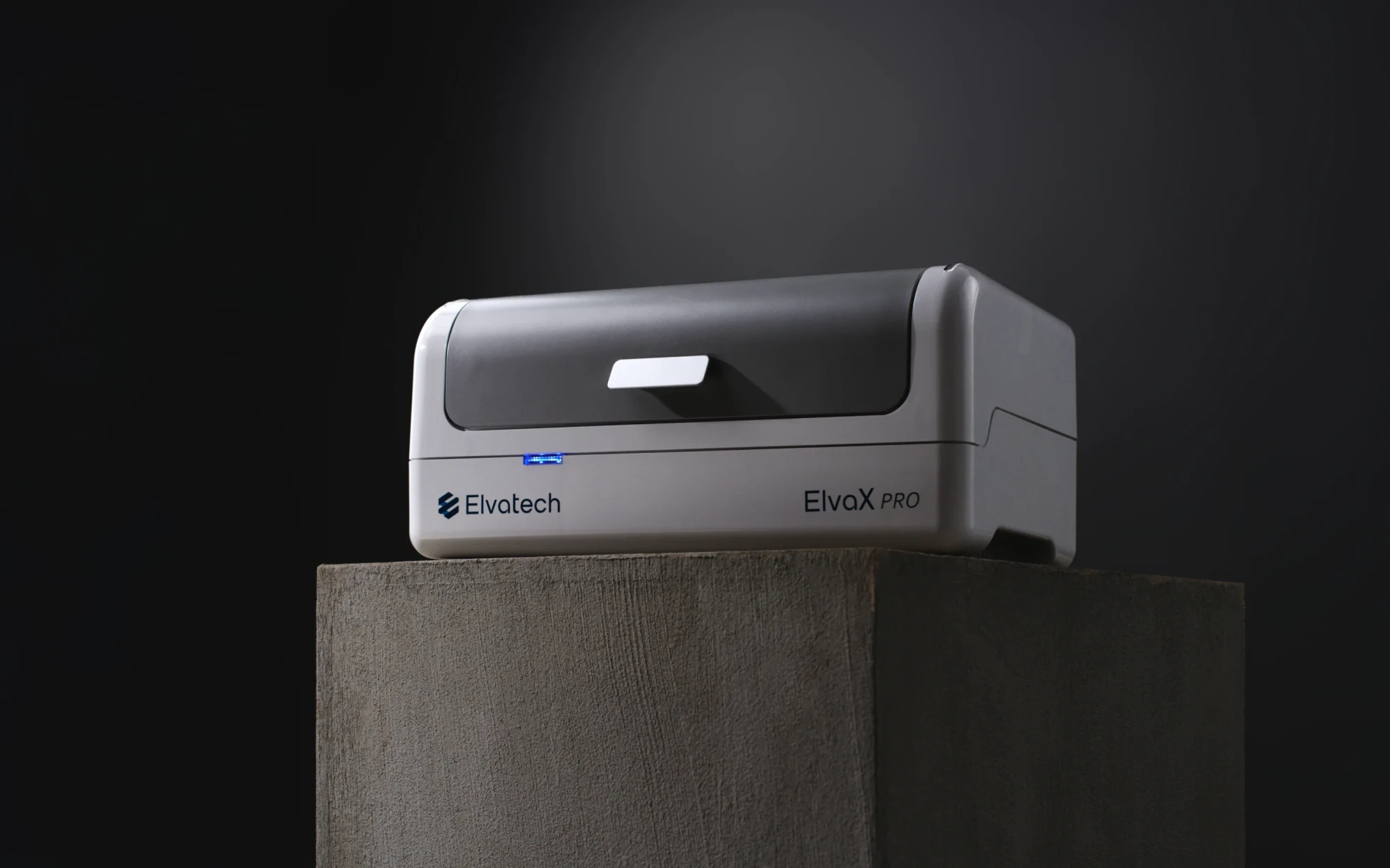
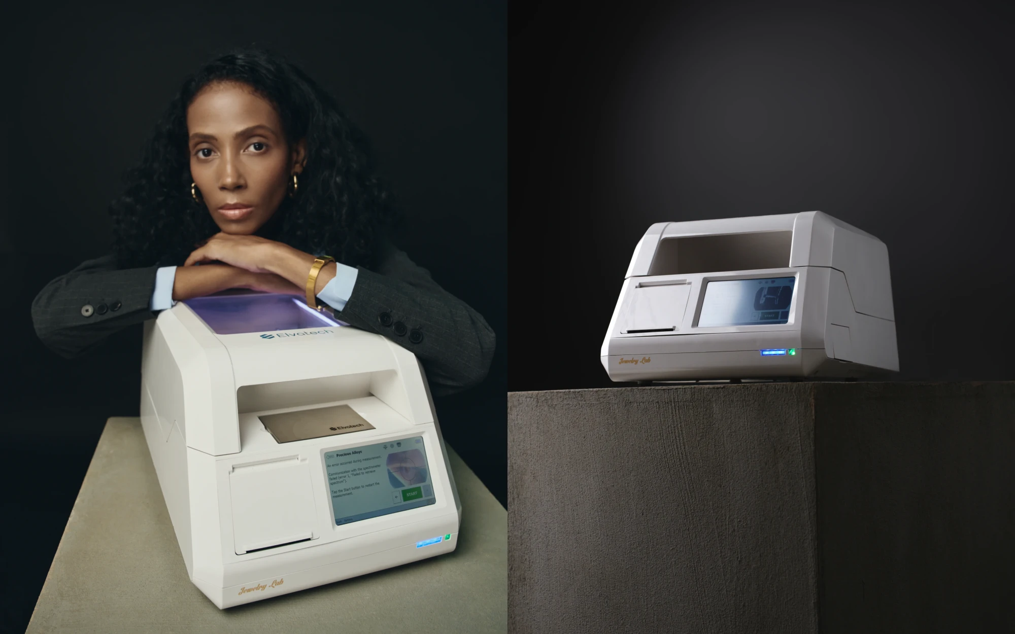
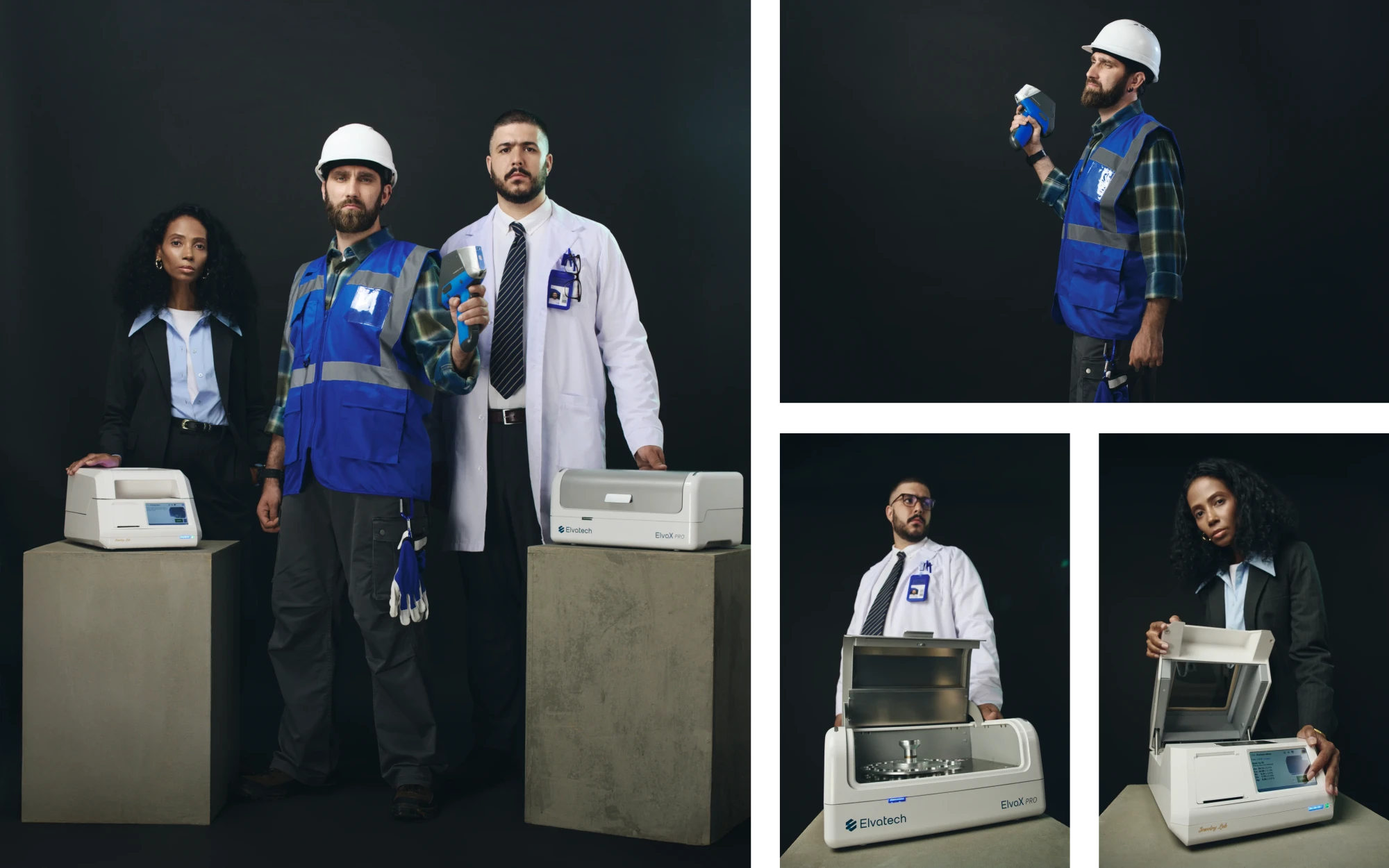
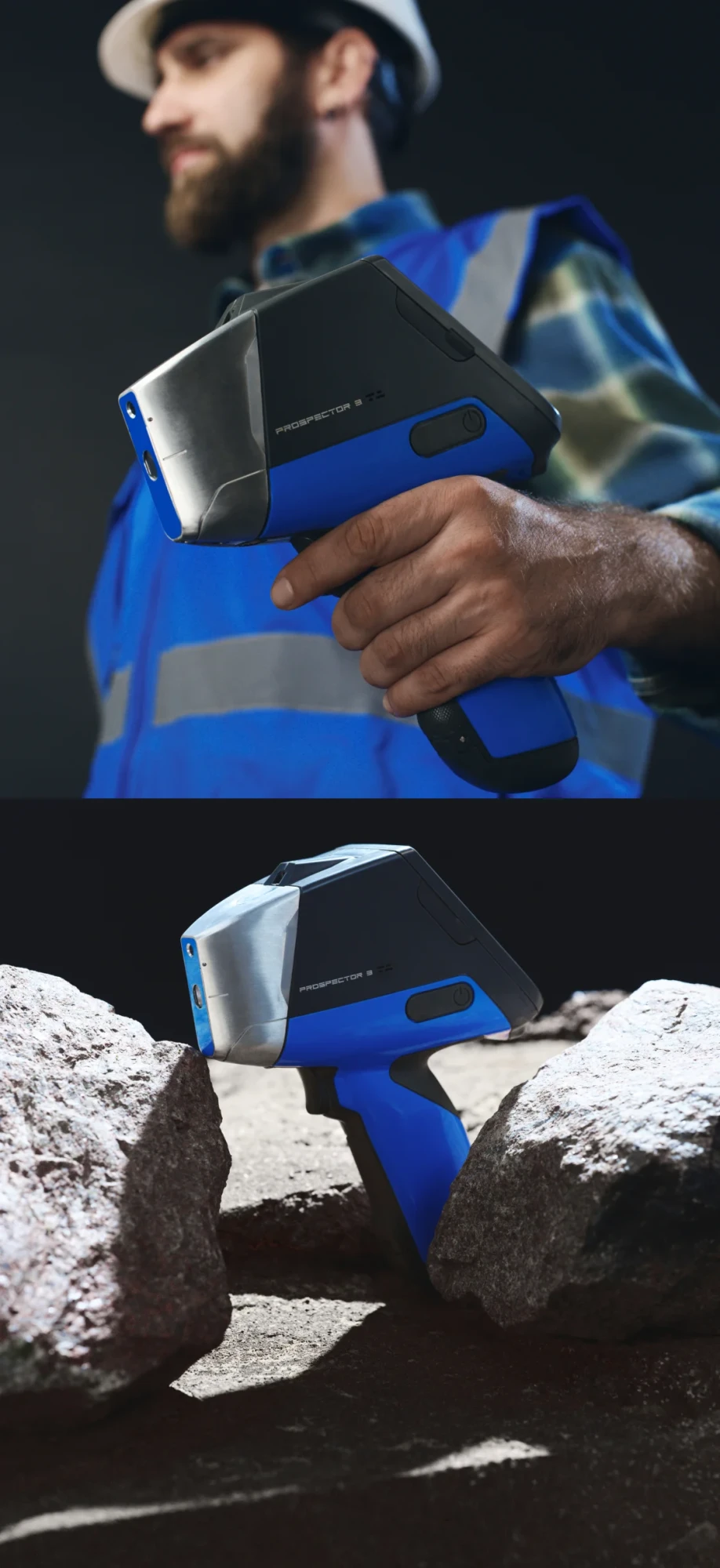
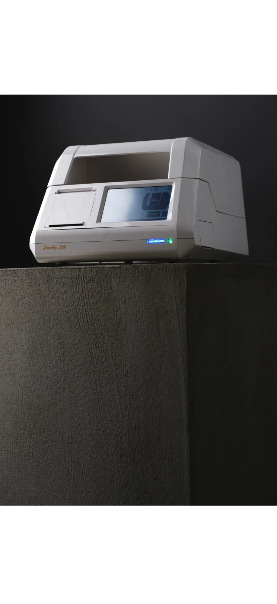

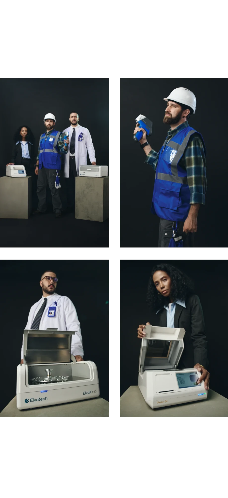
Elvatech believes that confidence can turn anyone into a hero. After all, Elvatech doesn't make mistakes.
“The many constraints created a number of challenges, which made the project all the more interesting.”
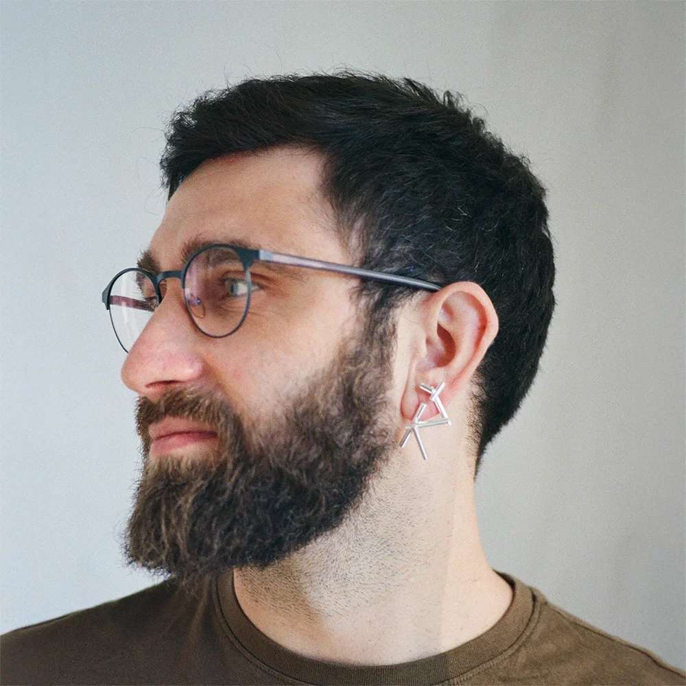
Ihor Hanevskyi
Designer Team Lead in Grape







.webp)
.webp)