0%.
Loading
Finance
2023
Money24®
Currency Service
Money24 is a brand that has traveled the path from a network of exchangers in the west of Ukraine to the country's first currency exchange service.
00:00
Play video
‘Cause we need positioning
Everyone likes to count money, but not everyone likes to exchange it. Discovery showed that it is difficult to conduct currency transactions in banks, it is scary with street "money changers", and exchangers are a kind of folk solution. However, it is not perfect at all. For many, these are nameless holes in the walls that do not cause positive emotions.
The Money24 company outgrew this format a long time ago. Here, they offer a loyalty card and exchange discount, address customers by name respectfully, and the team is genuinely passionate about what they do.
"So which kind of money exchanger is Money24?" — asked the strategists of the Grape agency and formulated a new positioning. Now Money24 is a currency service. A company with a wide range of currency services and a new level of customer experience. Despite the name, people come first here, not money.

‘Cause we need a design
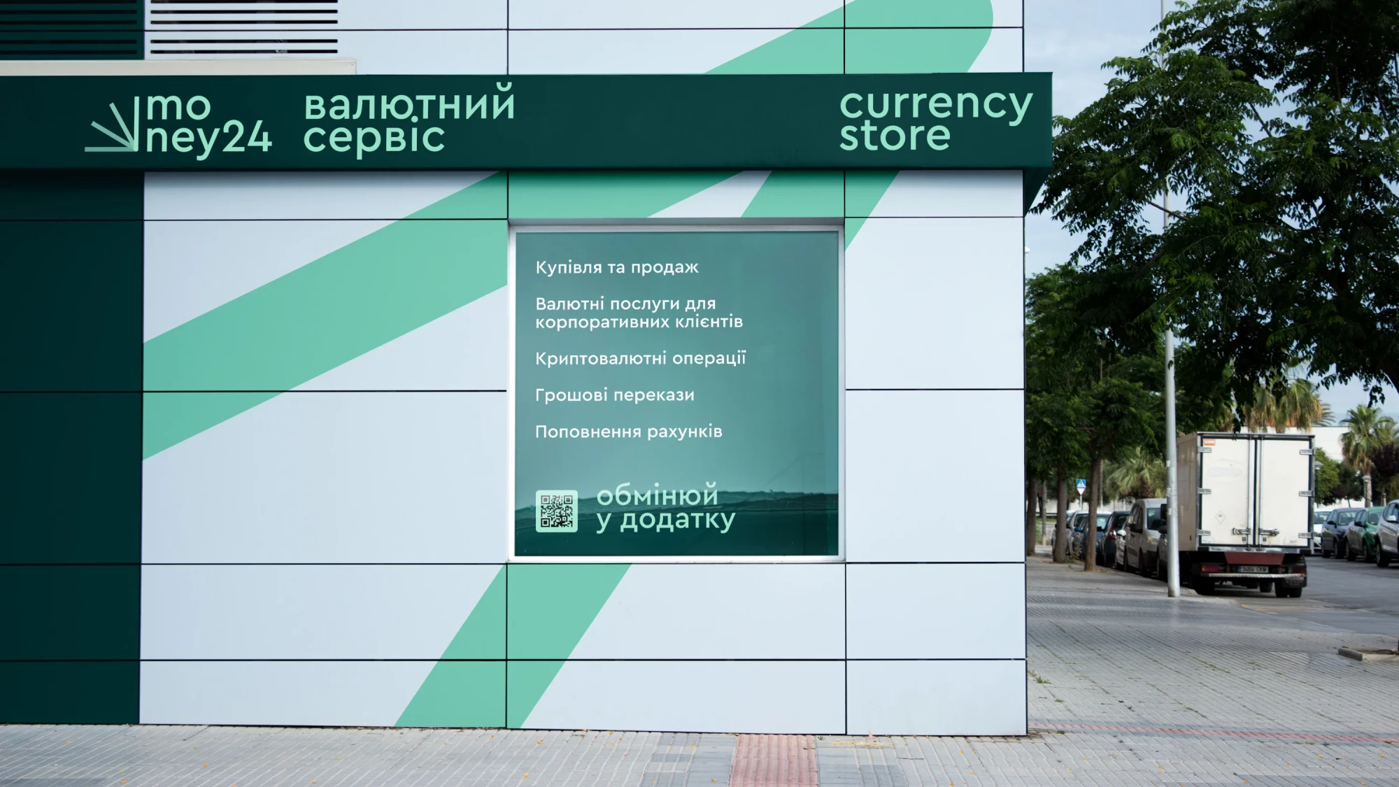
To make this change visible, the creative team set out to develop a new identity for Money24, because the favorite place for currency transactions should look and feel accordingly.
"The main task for us was to come up with a style of currency service,
because most exchanges look unattractive — just a mass with a yellow and black palette. The work began with the development of the logo, based on the banknote counter. We wanted to show a sign in dynamics. And so we divided it with a gradient," says the designer of Grape, Volodymyr Klimyk.
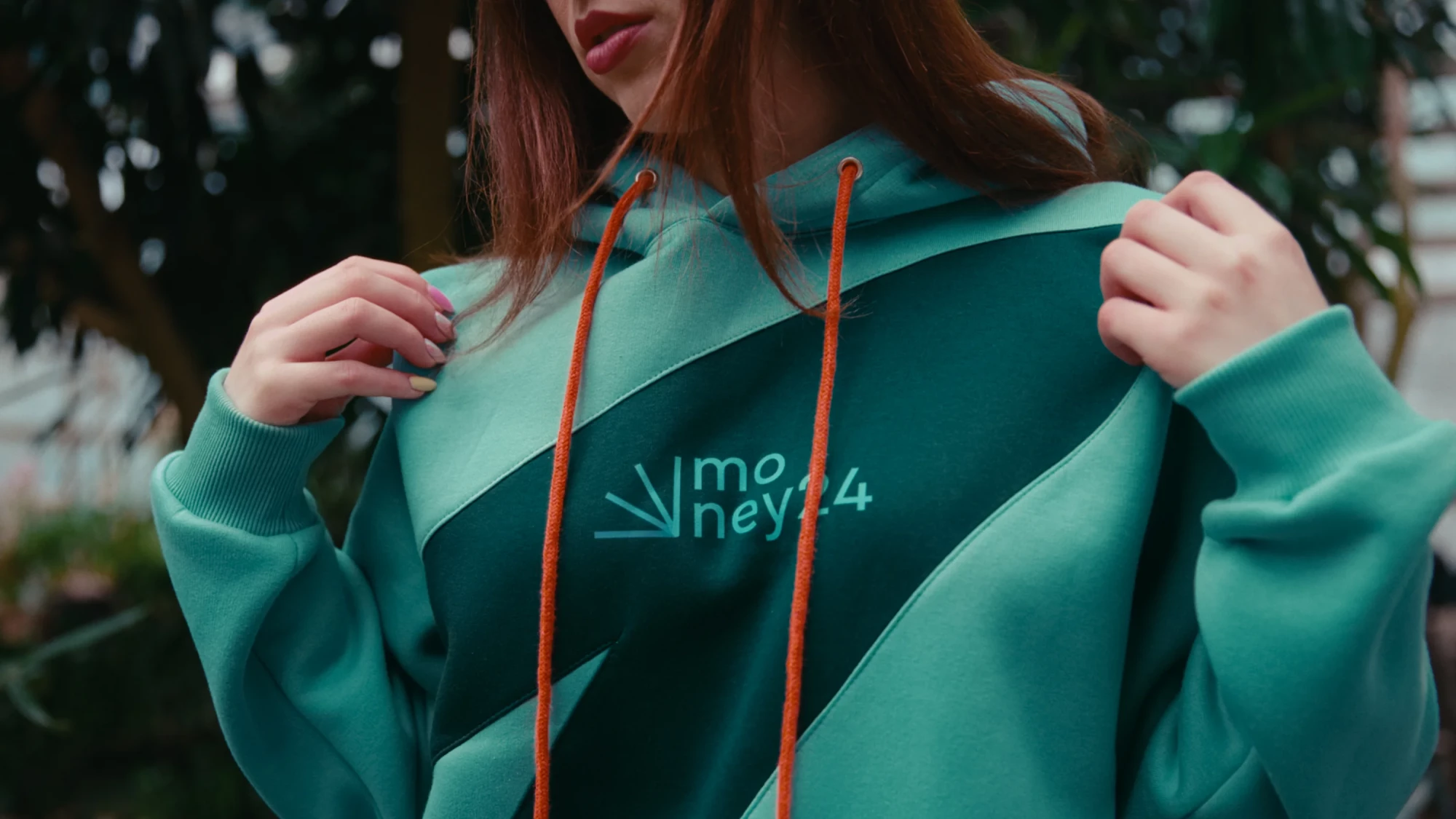
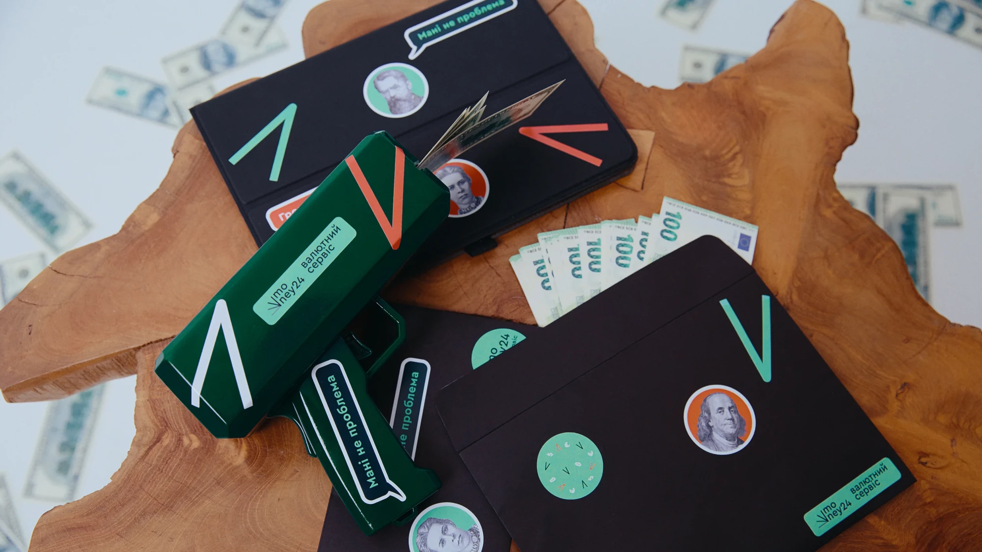
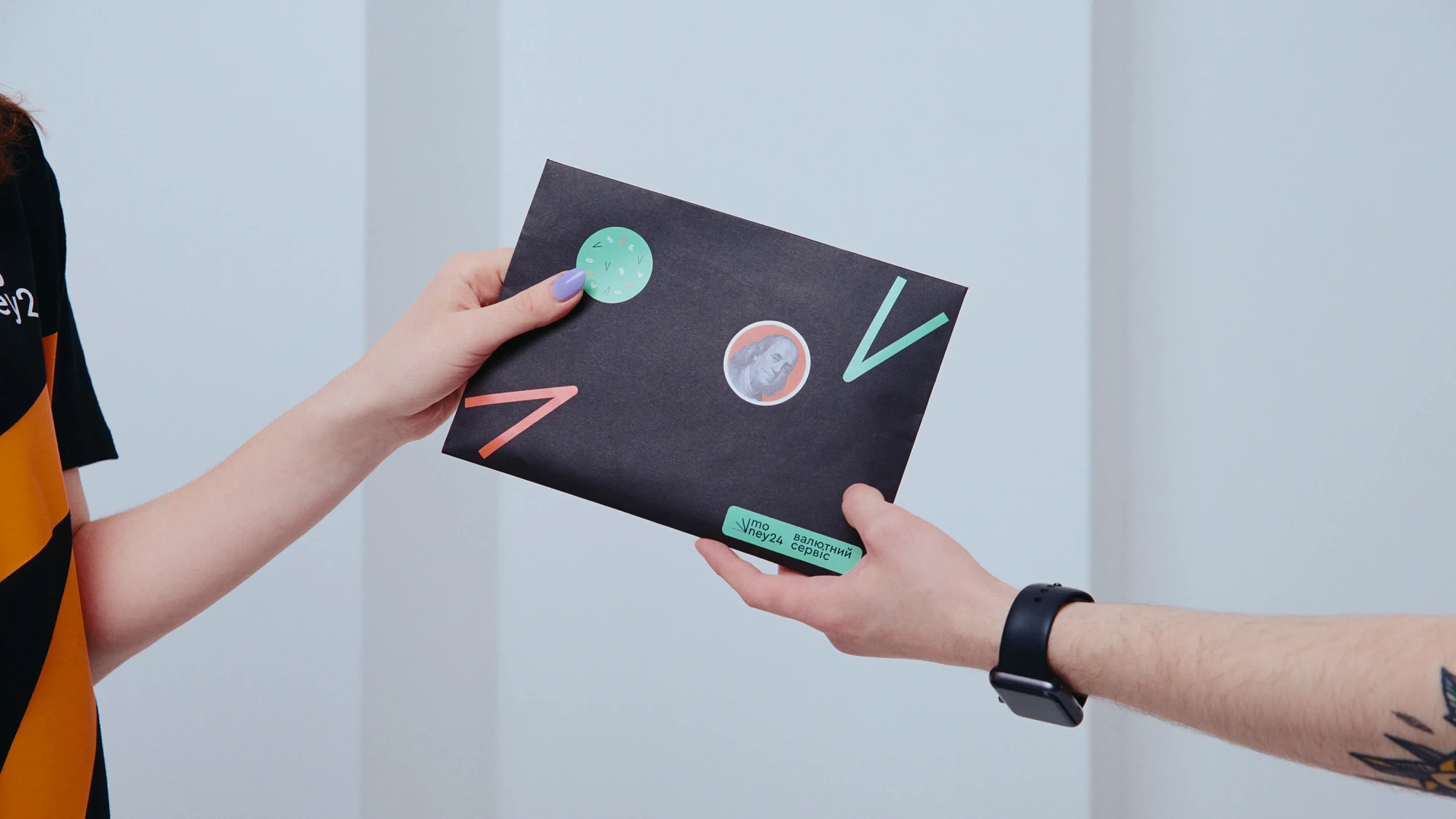
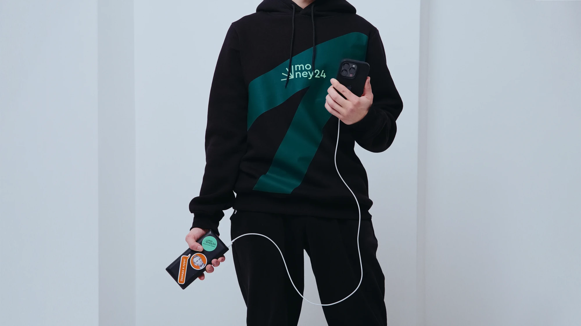
The color palette was based on dark green and paired with mint — because these are the colors of the most popular currency on the market. Bright orange became an additional color to highlight accents.
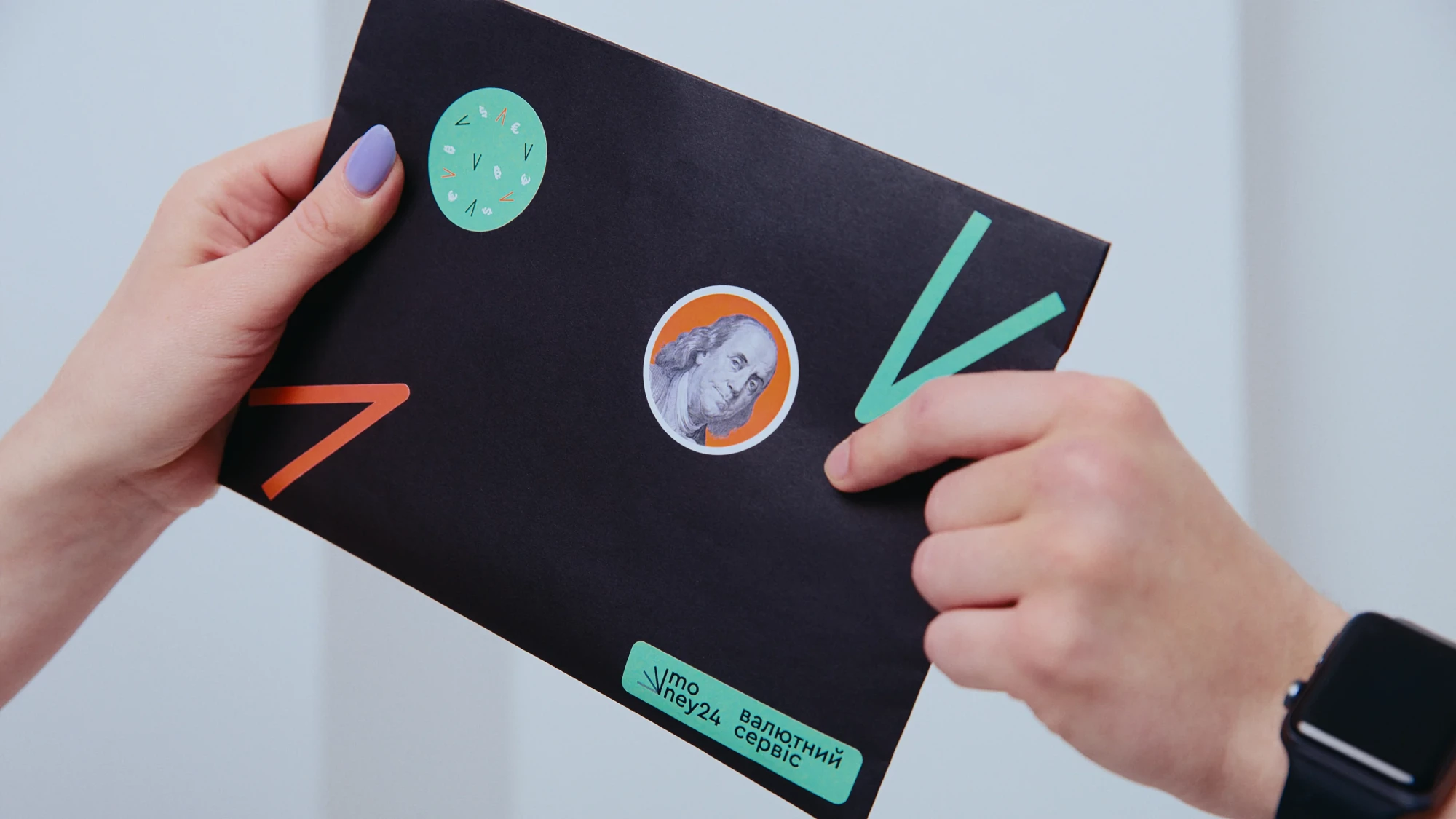
"As a branding element, we use an arrow, which is part of the sign.
It can be scaled and rotated as you wish. Now the logo is easily recognizable and reveals the essence of the business. There is no shame in going to such a foreign exchange service and exchanging your hundo," says Volodymyr.


‘Cause we need communication
When working on communication, the creative team took into account the fact that the currency service is a new phenomenon for Ukrainians. Therefore, in addition to talking about brand renewal, it was necessary to explain its meaning.
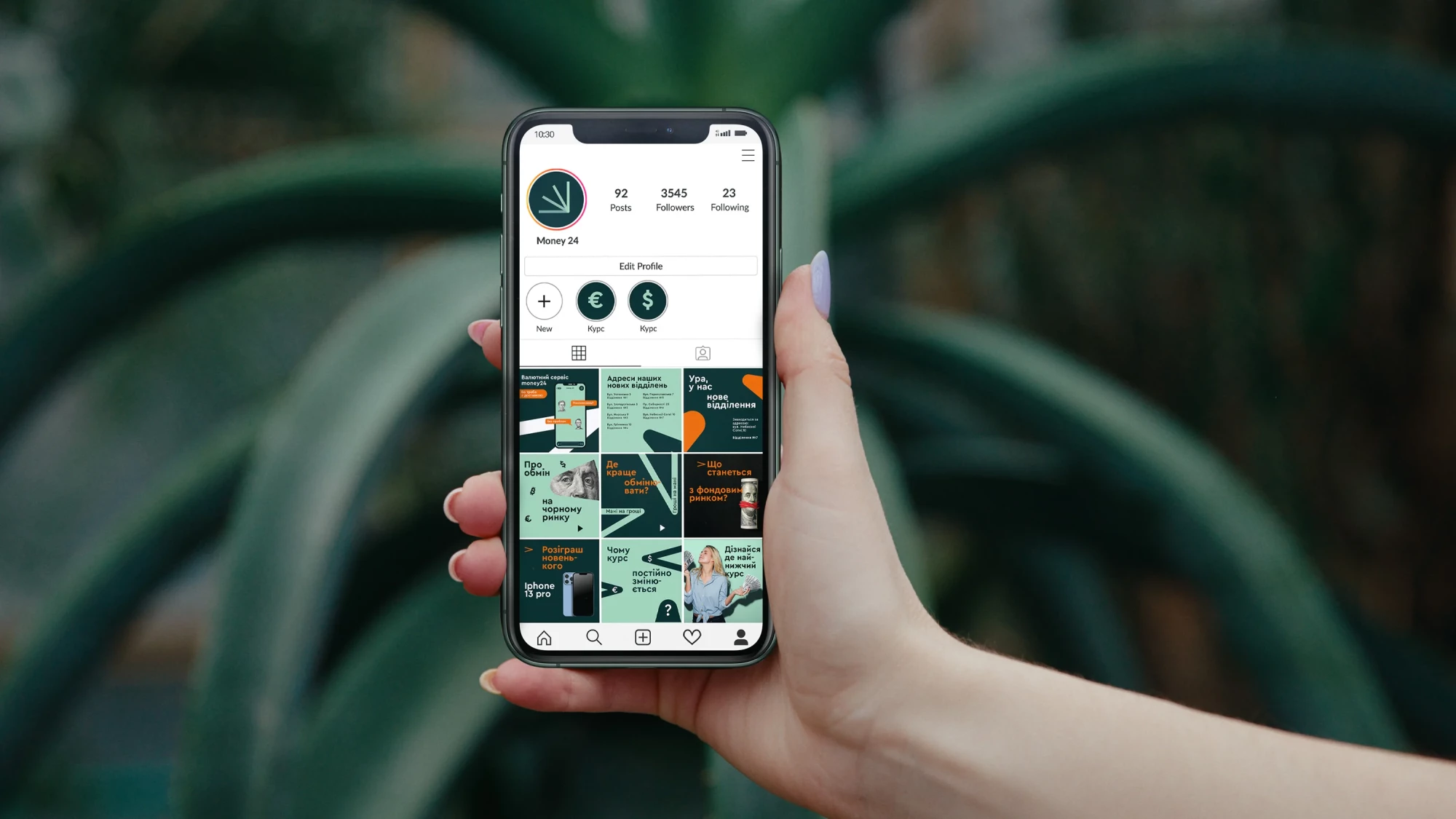
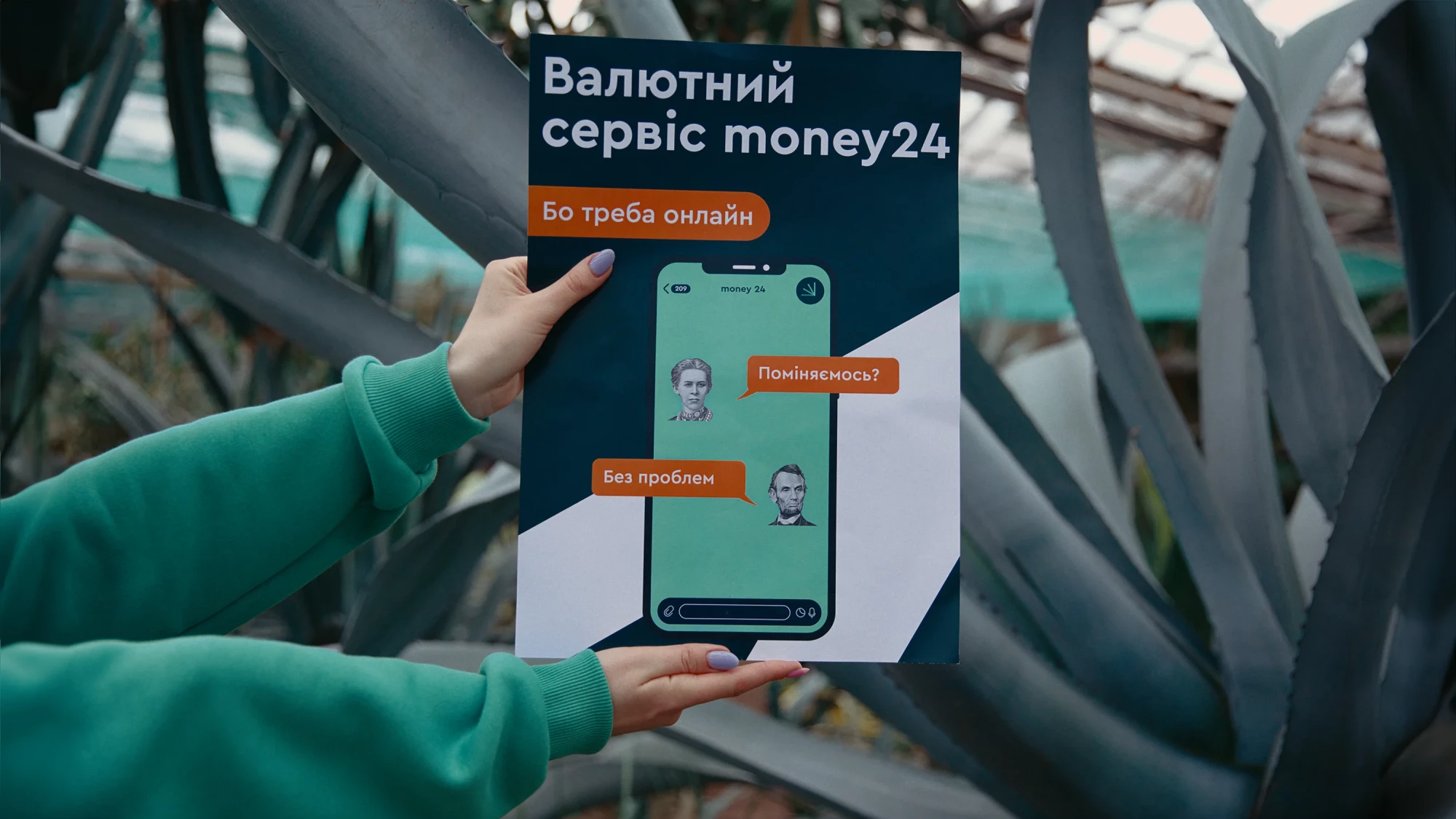
For this, they found an insight: people use the currency exchange service not for money or entertainment, but just "because they need '' to satisfy their currency exchange needs. This is how the platform was born: currency service for your "because we need it".
Money24 is exactly that currency exchange service that satisfies all currency "because we need it": it transfers, conducts transactions with crypto, insures, and, of course, sells and buys currency.
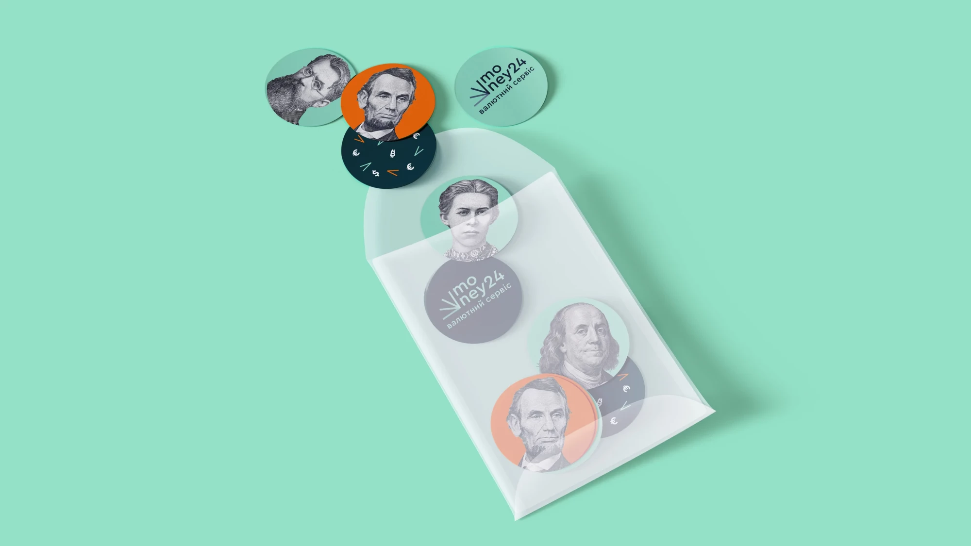
"To create communication appropriate to the strategy, we decided to use money as characters. Lesia from the two-hundred-hryvnia bill started to speak as well as Franklin from the one-hundred-dollar bill. And so that it would not be so monotonous, we added simple and clear illustrations to the series that reveal the services of the currency service," recalls the creative director of Grape Oksana Denha.
That's how Grape changed the exchange!
Check out our other projects ↓
